5 Landing Pages You Need to Manage Your Reputation
Your reputation is important. Branding is a fundamental focus of successful businesses. Companies spend fortunes watching social media for mentions, checking out reviews, paying for review posts on popular blogs, advertising through influencer videos, dealing with customer service complaints, and holding massive customer engagement campaigns.
Certainly, you’ve been doing your best on a more limited budget. But have you been building landing pages for the task? Believe it or not, landing pages can be one of the best possible ways to manage your reputation, because they give you total control over the narrative.
Landing pages work for both reputation management (because they are able to rank for your brand name) and traffic + lead generation. (If you do this right, they are able to direct clicks to your site.)
Where else can you get that kind of power? Through a social media page? Blog comments? Video responses? Nope! On a landing page, you can present the image and information you want and use it to help cultivate your reputation from the very first click. Everything else will follow.
How to Brainstorm Your Reputation Management Landing Page Topic
The key word here is “reputation.” That is, we want these landing pages to have a dual purpose:
- Rank in Google for your brand navigational terms.
- Direct customers to your most important selling point.
That being said, #1 is your priority: The more pages that rank in the top 10 for your navigational queries you can control, the better. The more assets we create to target brand-focused queries, the more we can control.
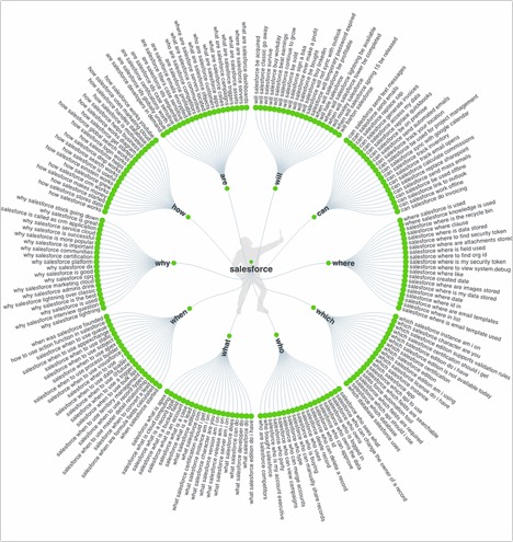
Before getting down to creating the below pages, do some research. Run your brand name through tools like Answer The Public and see which search suggestions your (future) customers see. You want to control of those!
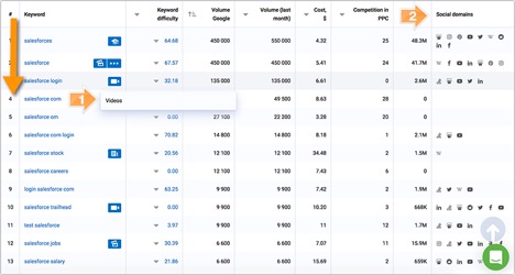
Additionally, run your brand name (and the brand name of your competitors) through your favorite keyword research tool and see what else you need to target those. I like Serpstat because it also shows (1) other types of search results and (2) various social domains that rank for each query. This gives me a good idea of what type of content assets I need to create.
Here are the 5 Landing Pages You Need to Manage Your Reputation
From there, here are five types of landing pages you can create, focusing on your important brand-focused keywords, on-site and off-, to build both your leads and reputation.

- “Start Here” Landing Page
Your landing page is a great opportunity to introduce people to your brand. What do you do? What is your mission? And what can you offer to the person who has found themselves on your site? An introduction doesn’t have to be long (though long landing pages have been found to be more effective in generating conversions).
Never assume that the customer knows what you are all about. A “Start Here” landing page gives you the opportunity to completely control the narrative and, thus, your brand image. It is a chance to give it a face, whether it is yours, a mascot, or just a general tone that will be carried on through the rest of your promotional materials and content moving forward.
These pages can also act as an “About” page, but I personally prefer to have both. One is directly attached to the website; one is a more thorough “hello” and introduction that is less about informing and more about engaging.
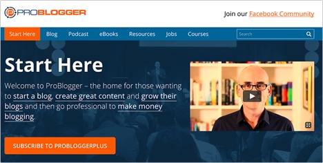
Darren Rowse’s “Start here” page features his video and call-to-action above the fold.
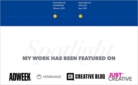
Robert Katai’s “Who Am I” page features the visual timeline of his featured mentions and shows logos of well-known websites that Robert was featured on. To get better insight into how Robert uses visual elements to build better landing pages, read here.
Further reading:
- How to Write a High-Converting “Start Here” Pageby Beth Hayden over at @Copyblogger
- Top 11 Landing Page Mistakes and How to fix themby Michael Jenkins over at @ShoutStrategy
When it comes to landing pages, never assume that the customer knows what you’re all about. CLICK TO TWEET
- The “Coming Soon” Landing Page
When I was launching a new content marketing service a few years ago, I had originally planned to use my website itself as a way to generate leads (via email subscriptions). It wasn’t long before I realized that the method that had been so tried and true for getting content out to the masses might not work so well for a direct B2C service that operated as its own platform. I was in a different ballpark entirely and didn’t know how to play the game.
I ended up creating a landing page (now offline) using Launchrock about three months prior to launch. Once I’d created the page, I aggressively promoted it, optimized it, talked about it in guest posts, linked it on social media, and really improved the ranking for the page in particular, instead of my general website.
The landing page itself had a brief video introducing my coming service, the launch date, and an email subscription form for an exclusive invite for the initial opening. I generated so many leads! I was astonished and have been a big believer in landing pages for lead generation ever since.
A great thing about Launchrock (or any other similar service) is that you can host it right on their site and get it ranked for your brand name too.
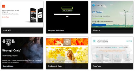
There are lots of cool templates and ideas for your own coming soon landing page (you can steal some here), so you can play a lot until you are satisfied with the result.
- The Seasonal Minisite
Several years ago HubSpot created a minisite for the holidays called HolidayHub. They paired it with a hashtag campaign of the same name and promoted it like crazy. It was essentially the same as their regular website but in a smaller form, with limited features and a holiday theme. It was essentially a landing page, but more.
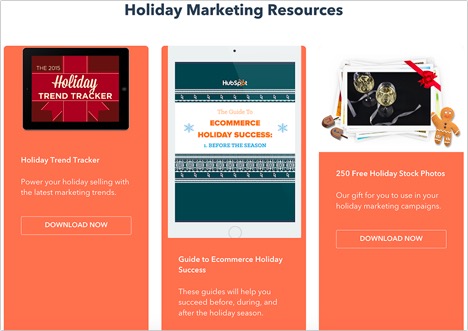
Everything on it fit back to the holiday theme, including guides and tools. It had a countdown to Christmas on the top. At the bottom was a sign-up form for a free assessment through their service.
Not only was it incredibly effective, but it more or less popularized minisite landing pages. They are among the most suggested landing page styles by experts, as they give a taste of your website without a lot of the clutter. You can better control what people see and base yours on a theme that attracts continued interest through that period.
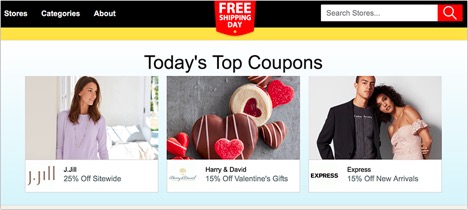
You can even buy a new domain for your minisite and rank it for your brand name or other important terms more easily. A good example of this tactic is Free Shipping Day, which is operated as a separate website by the owners of CouponSherpa.com and ranks for a variety of free-shipping-related queries.
What happens when the time for that theme passes? Make another one!
- The Social Digest
Social media is a great way to get attention, but it can be pretty disconnected from landing pages and even overall content marketing strategies. It is more like a secondary platform, and trying to combine the two can be hit and miss—which is why I love this idea so much and have found my new favorite tool.
Miappi takes all of your social media and curates the best content that is gaining the most attention from your followers. Then it puts it all up on your landing page in an easy-to-read digest that visitors can check out and get updated with regularly.
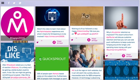
What I love about this is that it removes the onus from my followers to go to every single social media page I have. I don’t like to post everything to the same accounts, as that method of social marketing has long since fallen by the wayside. Instead, I’ve created a more solid strategy that uses each platform for its own unique engagement. A social digest takes advantage of that.
- “Offer Ended” Landing Page
Your special offers may expire, and your products may become outdated. Yet, the expired offer may haunt you for ages: It will be strongly associated with your brand, and customers will keep asking you about that. Don’t delete your outdated landing pages—they can still rank for your brand name! Instead, rebuild them into something that will help to keep the customer.
The “Offer Ended” page will direct people to posts, pages, products, updates, or anything else relevant at that time.
Let’s say you have a new promotion that gives 20 percent of a year’s subscription to your service. You can place a banner up on the landing page that announces and links to your cart with a promo code auto-filled. Or maybe you have a new end of year guide with all of the tips you provided over the past twelve months. You could have it front and center.
An “Offer Ended” landing page helps your visitors find what they didn’t even know they needed.
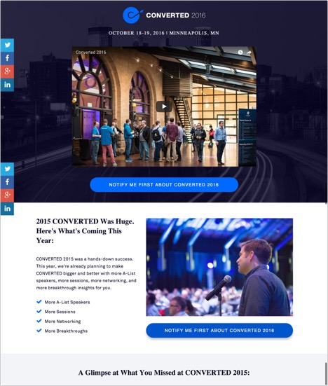
You can find great examples of “expired offer” pages with conference landing pages. If you don’t have the next event set up yet and there’s no place to direct traffic, use the old landing page to build up interest, as well as your list.
